Select Work
Private Residence
The question routinely asked about this house was, “why is there no front door?” Although a beautiful and unique home, something about it felt unfinished. Built in the early 1980s, the original owners definitely had an eye for detail, while most homes that were constructed at that time were emphasizing volume with minimal detail. The millwork is impressive, and the parquet flooring throughout a rarity. Although the new door is a dramatic change, the character of the house is intact and will hopefully be appreciated by generations to come.
Floor Plans
Determining Function & Balance
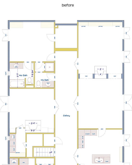
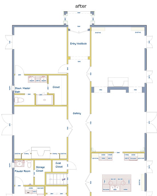
Creating an entry vestibule and adding a front door were the main goals we needed to address for this part of the renovation. We had the good fortune of a closet occupying the space at the end of the hall, which was creatively relocated. This change allowed us to incorporate the space into the hall and create the vestibule.
Furniture Selection
Developing a Design Aesthetic
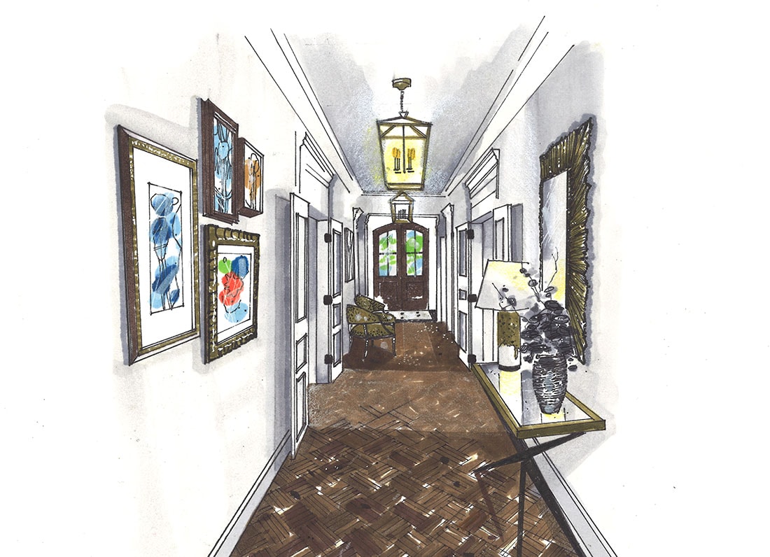
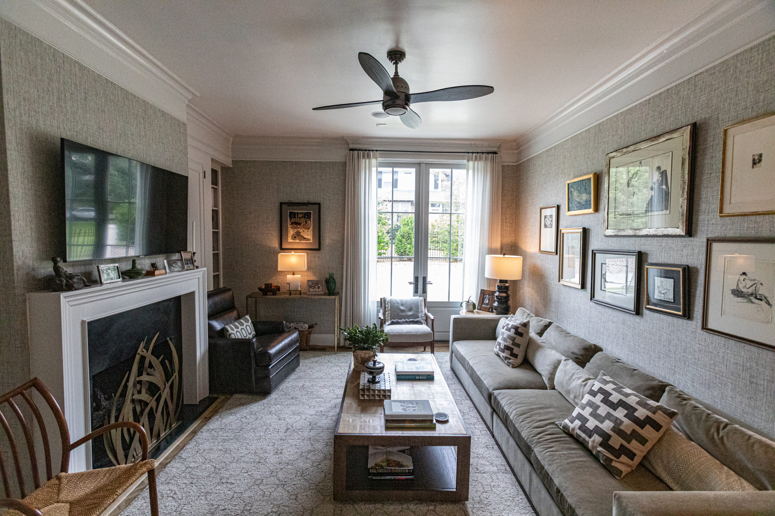
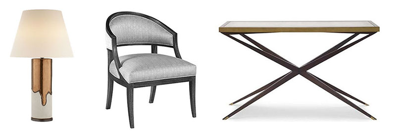
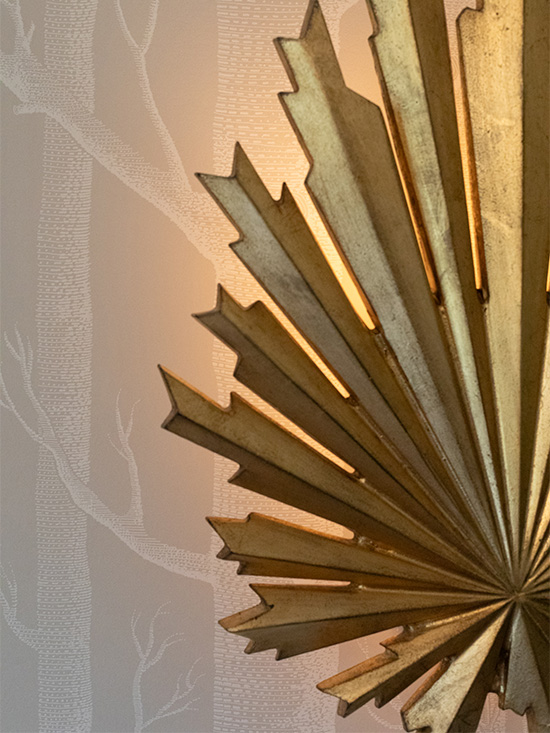
Furnishings are minimal in the hallway, but they play off of the classic architecture with a modern touch. Balanced lighting and eclectic artwork help warm the space that could easily have ended up cold and uninviting.
Renderings
The Vision
The texture of the floor and the effects of the lighting featured in the rendering express the feeling of movement through the space.
Construction
The Vision Comes to Life
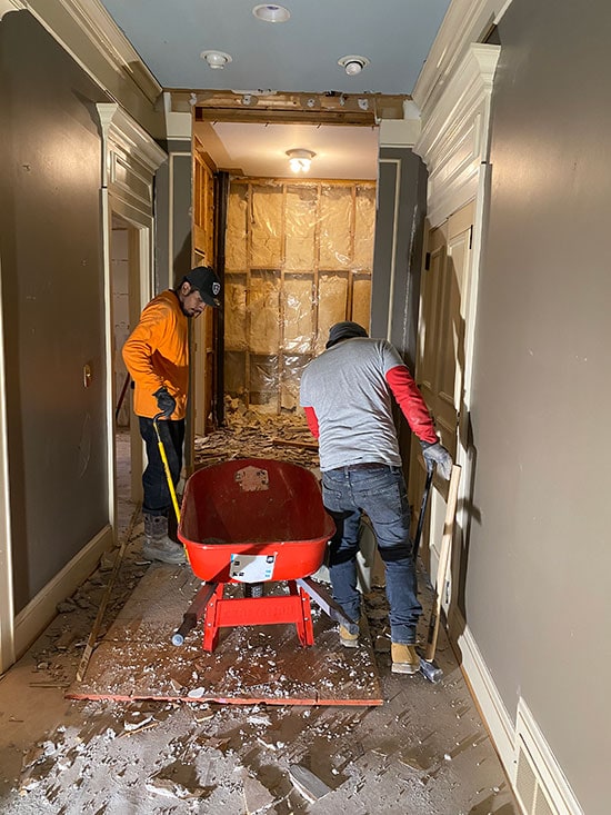
Renovations are always full of surprises, both good and bad. Opening up the walls, we did find some pipes that had to be relocated, but fortunately the new pilastered transition gave us the space we needed to conceal them. During the dramatic moment that the opening was cut for the new front doors, the lighting changed and the house instantly felt connected to the surrounding neighborhood.
Finishes
It's All in the Details
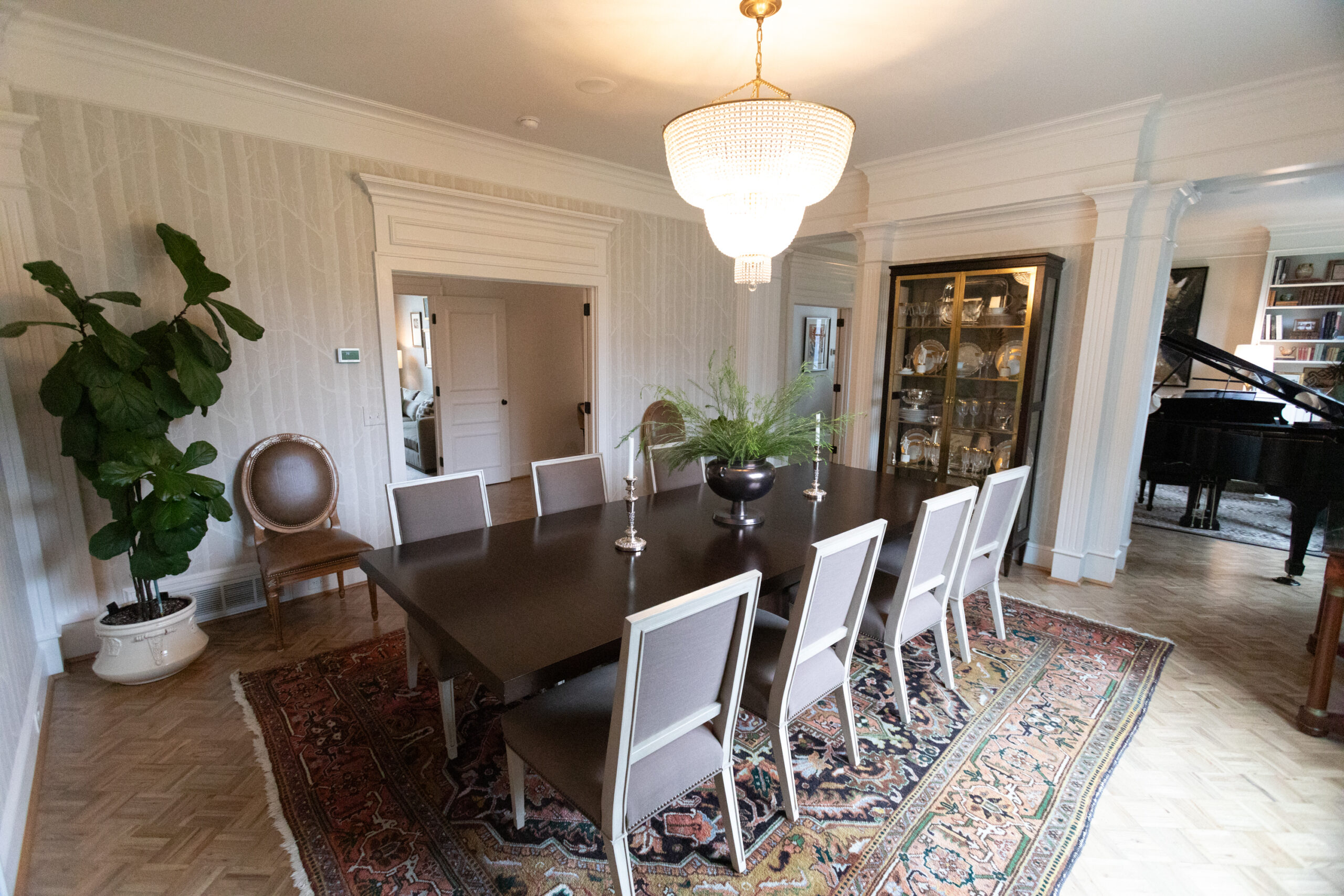
To delineate the entry vestibule, we were able to recreate the millwork application that was used to define the openings between the living room and dining room. The honed marble floor has a simple, yet classic feeling, while the arrangement mimics the layout of the adjacent wood parquet. The parquet floors were stripped, bleached, and finished with a light custom stain that appears antiqued.
The Final Product
The Results
The new entry, along with the additional renovations, have brought a new energy and life to the house. It was a dramatic change to the front façade, but again, the integrity of the architecture wasn’t compromised. Now the comments we hear are, “we love the new front door!”

