Select Work
Sorority House, Florida State University
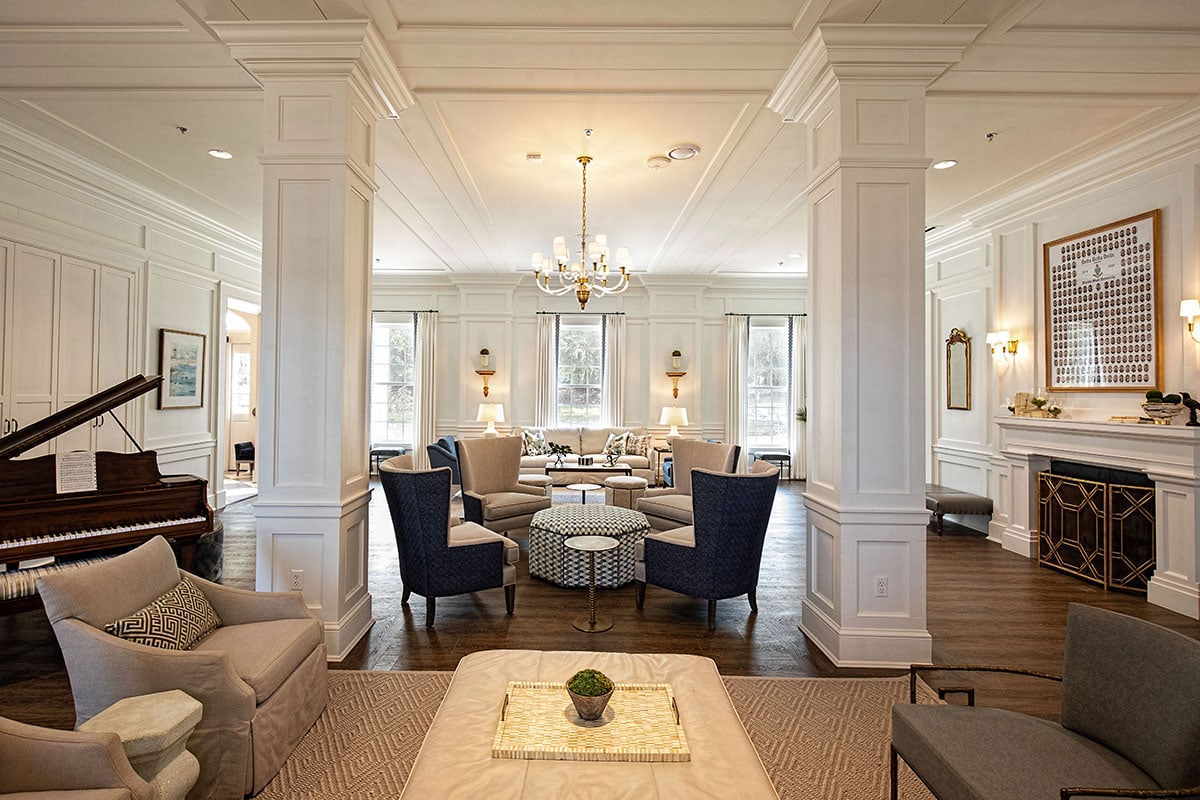
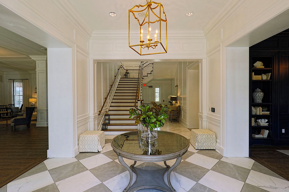
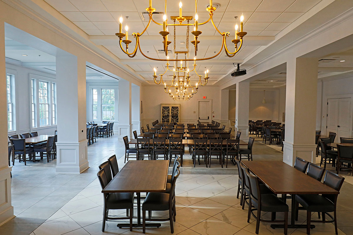
For a variety of reasons, our clients were faced with the tough decision of whether to take on an extremely expensive renovation to correct serious issues to their existing house, or rebuild instead. After much debate, the decision was made to rebuild, and the architect was tasked with designing a new house for their chapter. Having worked with WBA Architecture on a prior project, I knew we were in for an exciting project and a fantastic house. Filled with light, the house has a great flow and beautiful interior architecture. Most importantly, it carries a similar character as the original house but with more space and updated amenities.
Floor Plans
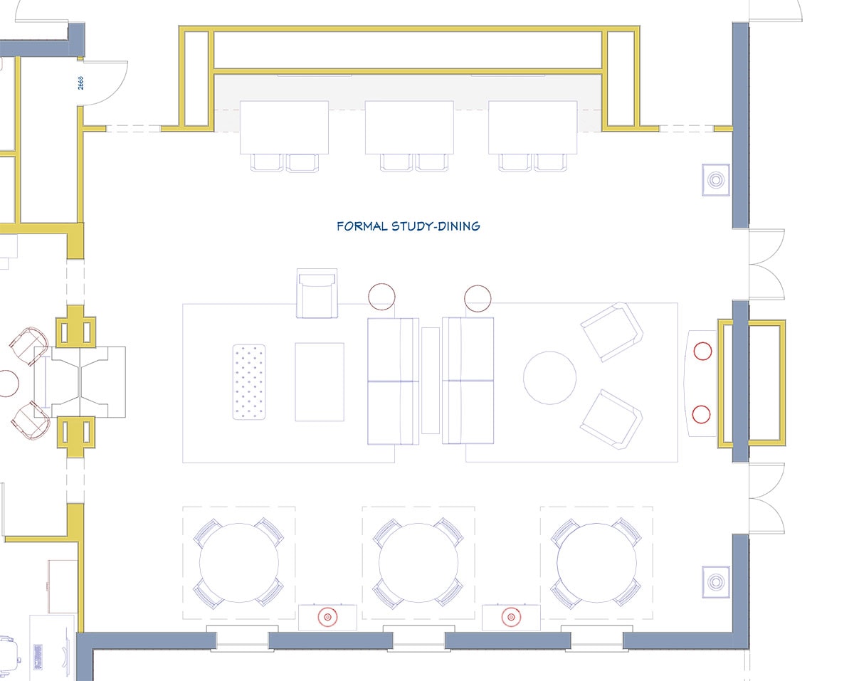
Determining Function & Balance
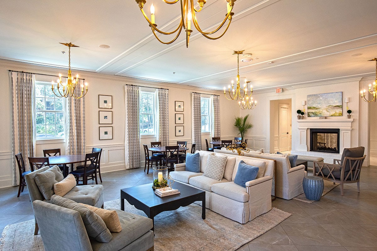
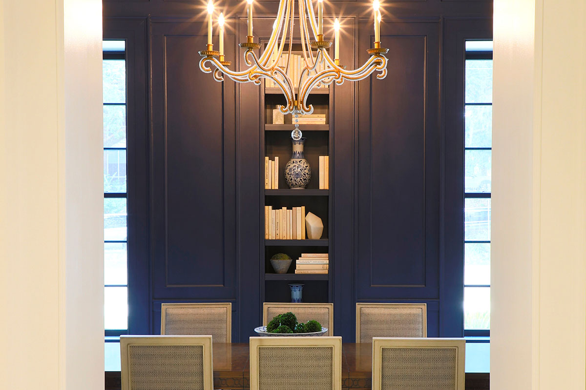
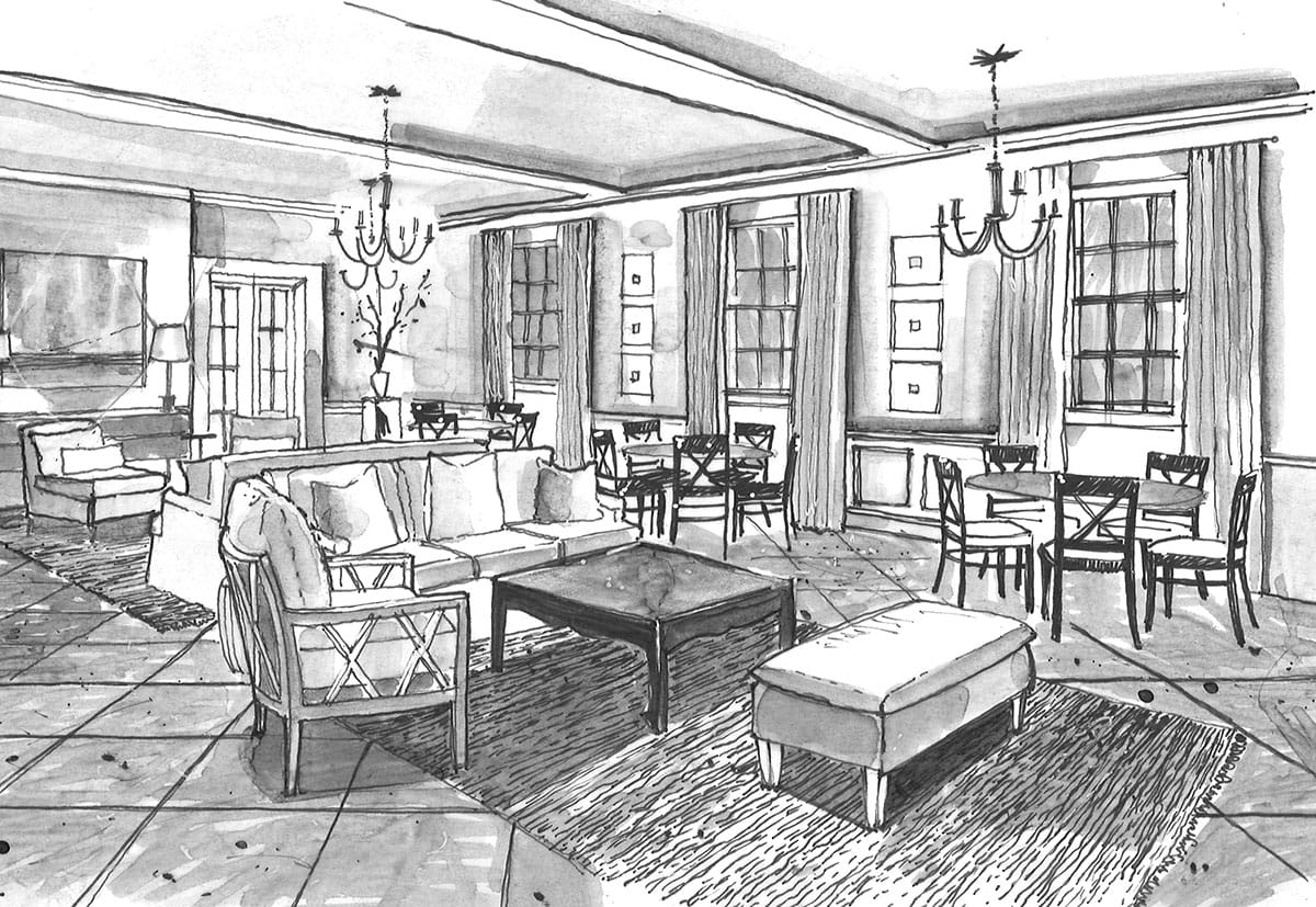
The function of the space was intended to be multi-purpose, so we wanted to make sure we addressed this primary need. The room we have highlighted here, The Formal Dining Room, is an auxiliary dining space which needed to balance the dining needs of a large chapter while also providing a study space and lounge space. Visiting the house today, you’ll see it is a hub of activity, so the goal was accomplished.
Furniture Selection
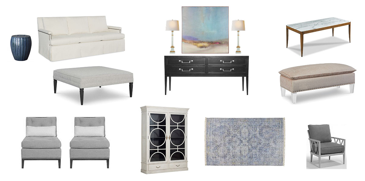
Developing a Design Aesthetic
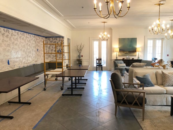
Today’s students' study habits vary, so we felt like we needed to offer them three options in one space. These three zones consist of traditional dining/study tables, a conversation/lounge area, and additional banquette seating along one side of the room. Surfaces needed to be durable and offer room to spread out papers and laptops, but we wanted to avoid using materials that felt too utilitarian or commercial. After all, this is the chapter’s home, so we wanted them to feel comfortable and relaxed.
Fabrics
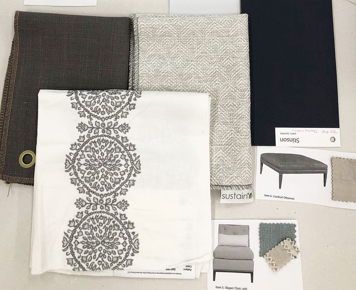
Color & Texture
Lightness and airiness were the words the client shared with us when we started the project. Using soft neutrals and pale, dusty blues with an emphasis on texture instead of pattern, the room feels calm and inviting. Of course, durability is always important, so we were careful to select fabrics that could hold up to the use of an active chapter.
Renderings
The Vision
We’re lucky to have Chase as part of our team as he’s a gifted renderer and can convey the vision beyond a two-dimensional plan. His drawings not only capture a 3-D window of what we’re trying to achieve, but they also are able to express the feel of the room.
Construction
The Vision Comes to Life
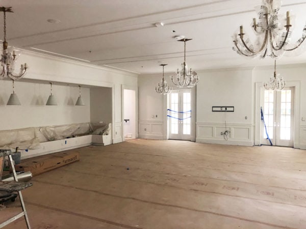
Always a highlight of the design process, seeing the space for the first time is exhilarating. Although we have a grasp on scale and proportion, viewing it from a variety of angles and seeing how the light affects the space is valuable information in case we need to make any adjustments to our design plans. It might be something as simple as moving a mirror you planned to use on a wall, either to avoid an unflattering reflection or the glare of the rising sun.
Finishes
It's All in the Details
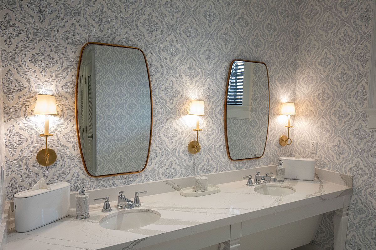
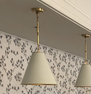
Lighting is an exciting part of design, but there needs to be a balance of how the light functions and the overall aesthetics of the fixture. The warm brass tones of the pendants we used in the banquette area tie in with furniture finishes and lighting in adjacent rooms. Backed by the beautiful wallcovering we used in the niche, we were able to create a cozy area for study or conversation.
The Final Product
The Results
Most important to a successful venture is a strong team, and we were fortunate to have one on this project. We all had our challenges along the way, but addressing them together allowed us to achieve our ultimate goal, which was building a house our client could call home.

